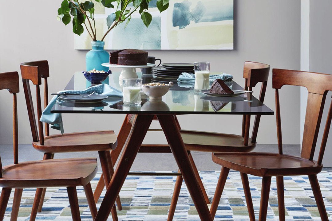
How to choose a rug that matches your space harmoniously

- The matching principle is near first and then far. The color closest to the carpet is the sofa, the color of the table, chairs and stone panels → there is a systematic relationship such as gradual color relationship, but it will not be completely the same color and show a sense of hierarchy. The second and more distant goal is wall paint, wallpaper color and the main color of curtains → strive for harmonious colors without being obtrusive.
- If the totem symbols appearing in the carpet can echo the same marks appearing on the main sofa and even the curtains or pillows, it will have a bonus effect.

- Generally speaking, designers or architects like to match low-saturation building materials or soft furnishings, and the carpet configuration can be followed or appropriately increased to form a contrasting and lively space.
- Light-colored carpets have the effect of enlarging the space and calming the mind and body. Although the sense of space is squeezed, dark-colored carpets are generally recognized by the general public as being easier to organize and maintain than light-colored carpets.

Light-colored carpets have the effect of brightening and amplifying the interior space

- Plain carpets are a good matching option for minimalist and even entry-level buyers. Relative tapestry generally has a color combination of more than 5 colors, and carpet manufacturers will introduce popular colors for home use. It is not difficult to match.
- There is no absolute answer whether the carpet should be placed in front of the base of the sofa or pressed locally, or whether all table and chair components should be included in the carpet. It ultimately depends on the user's usage habits and the best presentation of the overall aesthetic.
The same color has a hierarchical configuration, and there are echoes of similar materials
dark rugs have a dramatic effect on large spaces

Plain colored rugs are versatile and also the first choice for beginners


